
I don't have the answer, I have a process to find it.
UX Design Process
Discover
Without the who and why, we create nothing for nobody
More Info
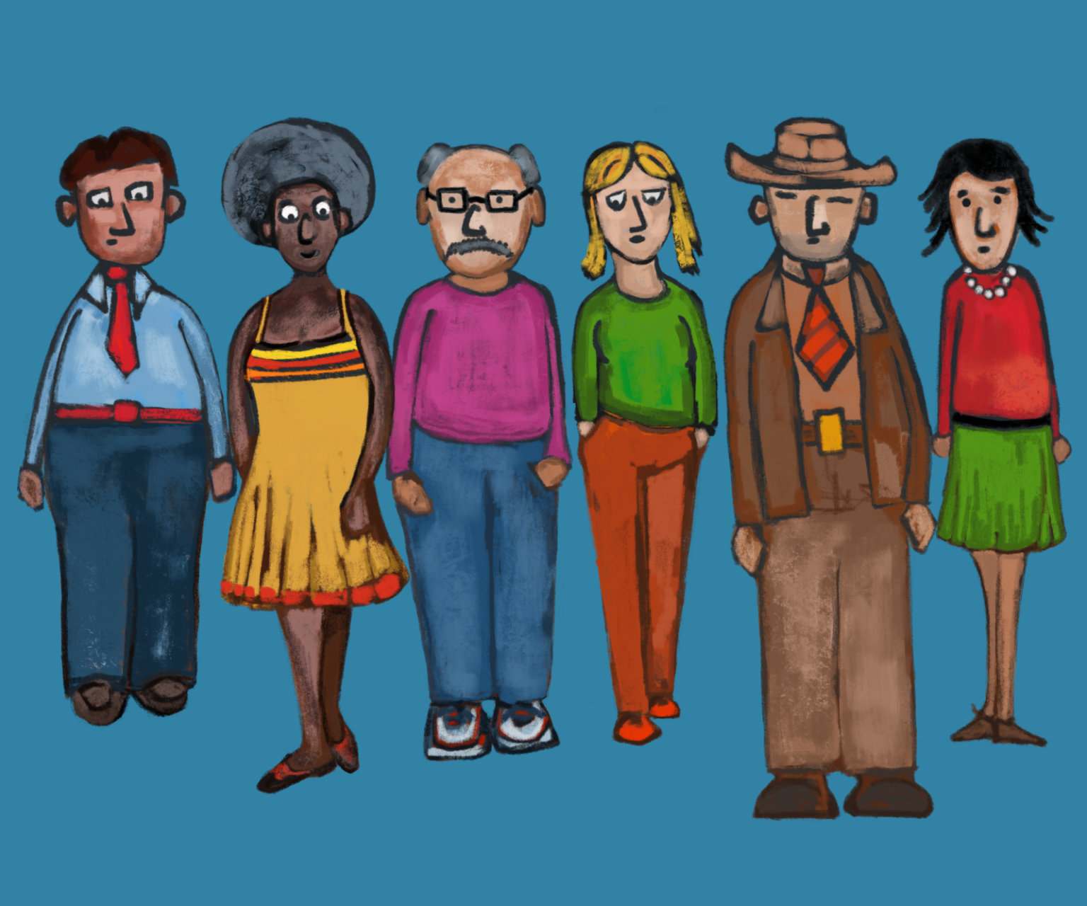
The discovery phase of UX design is the anchor of the experience. The goal is to understand the people who will use the application and the value proposition. This is the time to ask lots of questions:
- Who are the people that will use the application?
- Why would they use this?
- When would they use it?
- What other apps do they use while using this app?
- What problem does this solve for the user?
- What have people actually done with the app?
- Is the user the buyer?
- What problem is the buyer trying to solve?
- What does the dev, product and sales team think?
- What have they tried in the past?
- Why does the app work the way it does?
- What do other people say about the application?
- What data can we study?
- What is the competition doing?
- What is the business value?
- What business domain does the app exist in?
- What are the norms of the domain?
If working with an existing interface, it is a perfect time to conduct an extensive heuristic evaluation, identifying all areas where users experience friction.
Concept
Fail often and fail early.
More Info
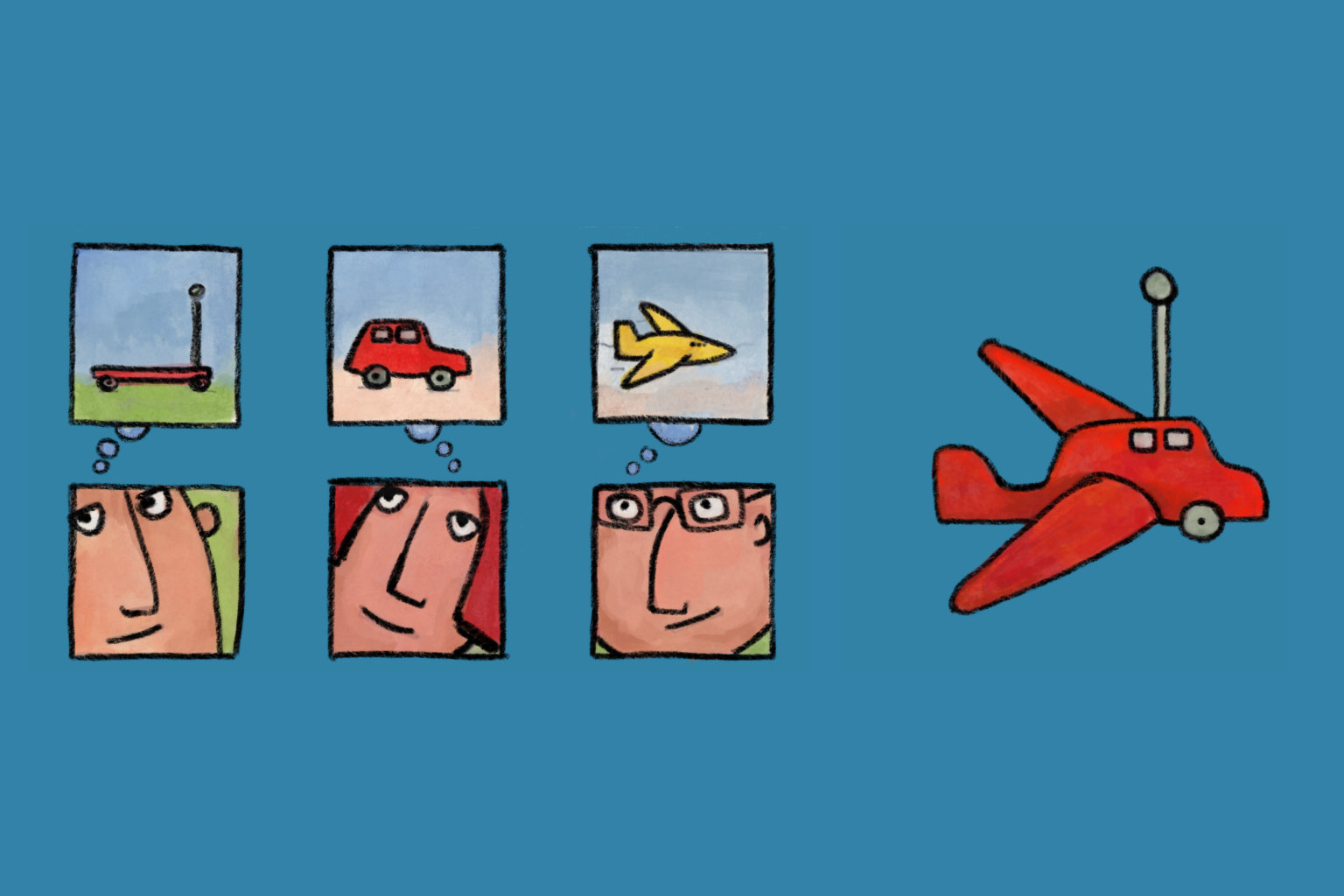
The concept phase is the time to brainstorm ideas that address the issues uncovered during discovery. The focus is to generate and dismiss numerous ideas quickly. We might script the story of a user experiencing the application to find ideas. Speed is crucial, so we rely on pencil (or pen) and paper to sketch interactions, focusing on ideas rather than details.
Validate
Designing an application is easy. Convincing people that it’s the correct thing to do is hard.
More Info
It takes a team to build an application. Present the best concepts and establish a shared vision early. Engage the team in the ideas to get technical validation and understand development timelines. Capture constraints for the detailed design phase. A unified vision is essential for the application’s success; otherwise, we risk building a hodgepodge of unmarketable features.
Detail
The devil is in the detail.
More Info
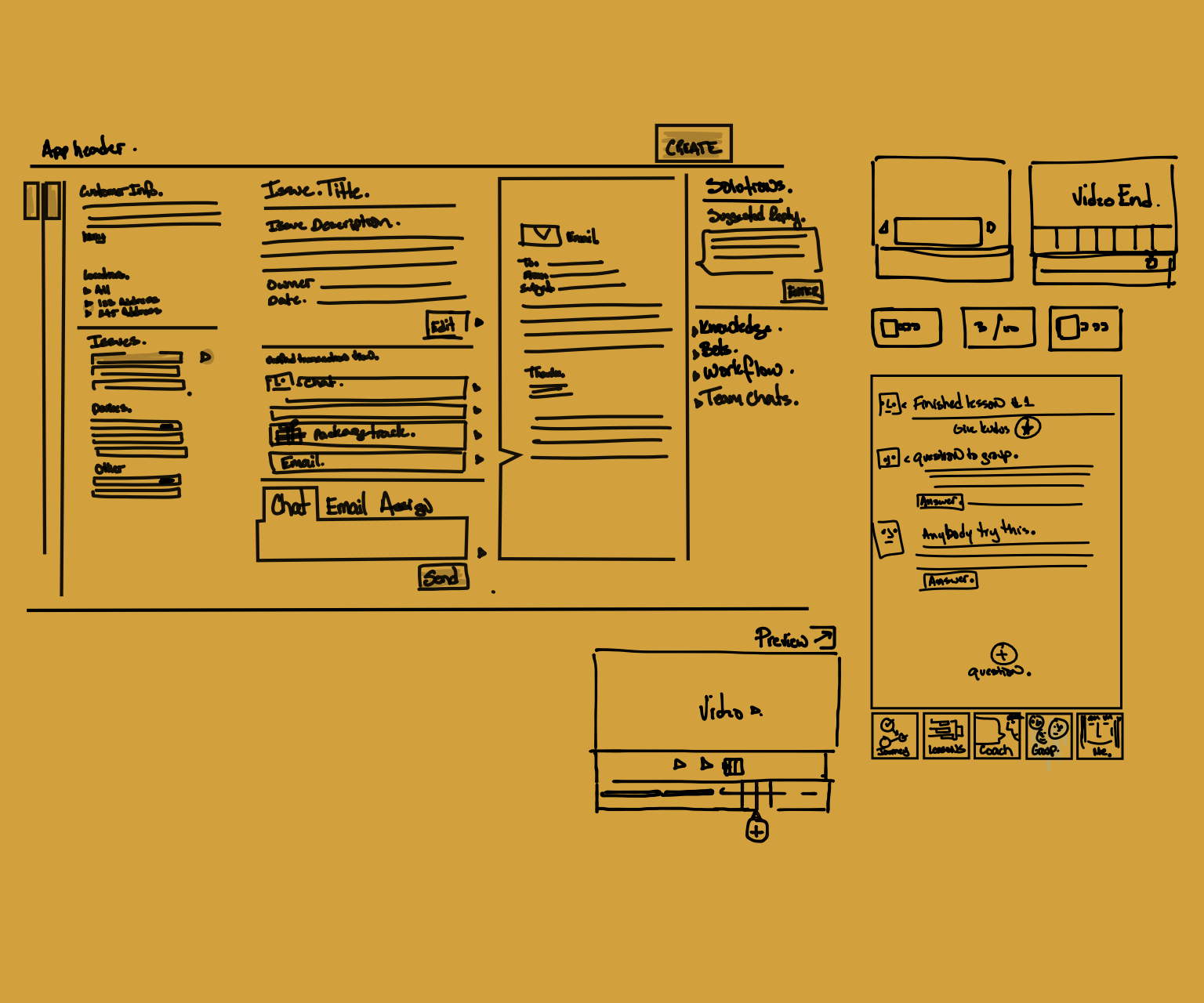
The detailed design step is the most time-consuming. Ensure we are working on the best ideas. Map the overall application flow and identify all interaction touchpoints. Show the first-time experience and user motivation. Demonstrate how the experience grows with content. Start with early wireframes and add voice, colors, and icons.
Prototype
It's cheaper to fail with a prototype than an application.
More Info
People struggle to give feedback in the abstract. A deck of design screens doesn’t put the user in the driver’s seat. The prototype brings things to life and simulates the application. It is the medium we use to observe people and conduct usability tests.
Usability
What people say, what people mean, and what people do are three different things. What we care about is what they do.
More Info
A usability test with actual users helps us understand the areas that need improvement. While we call this step a usability test, we are actually testing for both usability and utility. A usability test lets us know if we created an interface that successfully communicates with our users. Is it clear what they can do here? A utility test helps us understand if we created something of value, something a user would actually use. We need to succeed on both ends before we release the application.
The best way to test for usability is to sit back and observe people using the prototype or application. Before anything is clicked, we ask users to explain what they think each element on the screen does. This tells us if we have effectively communicated the interface’s features and functionality. Then, we proceed with tasks to see if they can be quickly and easily accomplished.
A utility test involves a conversation at the end, starting with the question: "Now that you have done this, do you see yourself personally using this in the future?" Our emphasis is on the individual and their actions.
A successful test tells us we are on the right track for development or release. A failed test is a valuable learning opportunity.
Timeline
The UX design process is not linear.
More Info
We frequently move back in the process to anchor the project with more research. We might sketch a new design if usability tests don’t achieve enough success. Projects vary in size, and software design never really ends. Once we release, we evaluate user impact and make changes, exploring future features and finding ways to introduce them into the application.
Examples:
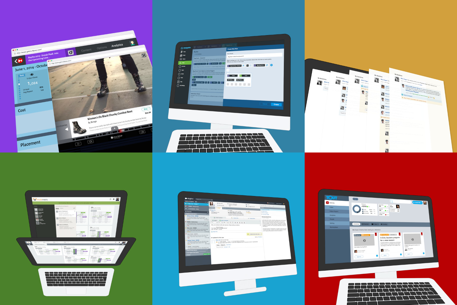
- A cooking application (Monj.com) was a 3-month engagement at 3 days/week to launch V1, including product management, UX design, investor pitch, and team recruiting.
- The Stubhub Call Center project involved extensive stakeholder and user interviews, with the vision pitch taking 6 months at 3 days/week.
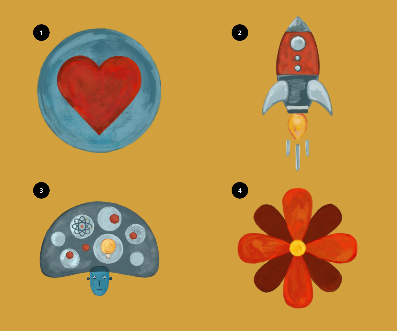
UX Goals
Make it simpler, faster, smarter and more delightful.
More Info
1. Simple. Focus on clarity — what, how, and why. Make it clear what can be done with the application, how tasks can be accomplished, and why the functionality is valuable. Simplicity is tailored to the application's users, not the general public. Knowing the users enhances simplicity.
2. Fast. Users are here to accomplish tasks. The faster they can do so, the more satisfied they’ll be, increasing retention. This goal extends beyond fast technology; it’s about creating efficient experiences that anticipate needs and present information appropriately. Simple experiences attract users, and fast experiences keep them coming back.
3. Smart. Devices can track location and store patterns. For example, if a salesperson opens a sales app in Austin, TX, they’re likely visiting a customer there — show relevant information. Smart experiences use automatic defaults, AI, and predictive features. The more we know about users, the smarter the experience.
4. Delightful. Delight and beauty come from the harmony of elements. Software is a commodity; a pleasant app encourages repeated use. Delight doesn’t mean colorful or pretty; it could be subdued to let content shine. Different interfaces serve different purposes — marketing pages need immediate discovery and brand extension, while daily-use interfaces should be subdued and data-focused. Both can be delightful in their own ways.