Account Feed
Salesforce.com
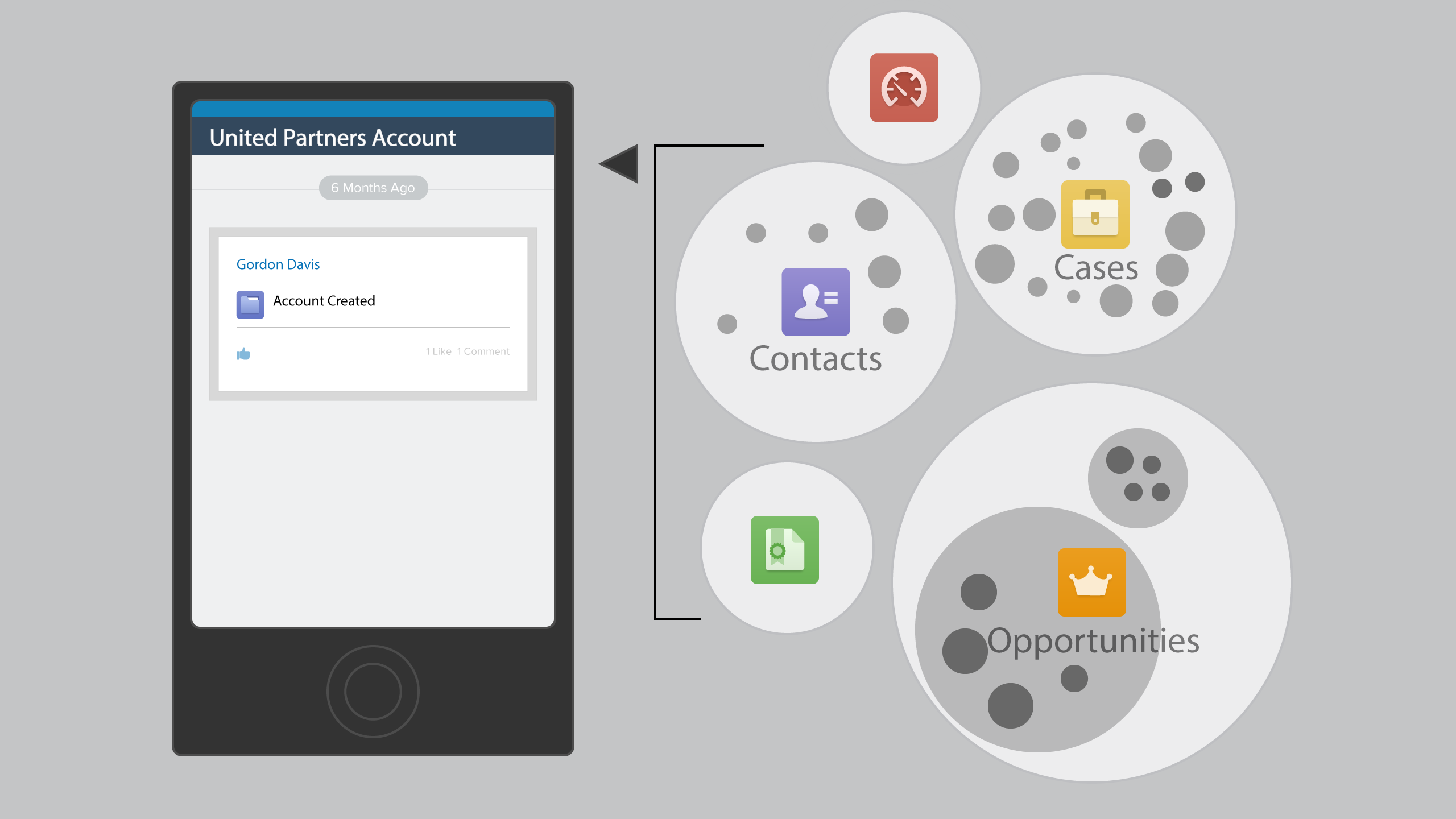
Problem: An account is an umbrella object for a customer on Salesforce CRM. The page is missing critical information. A user landing into an account will only see that an account is created. Unless they hunt for it, they will not know that useful information stored in related cases, opportunities, and contacts.

Solution 1. Show All
The easy solution would display an entry for every transaction, but that would create new problems. Conversations around just one case could overwhelm the entire feed.
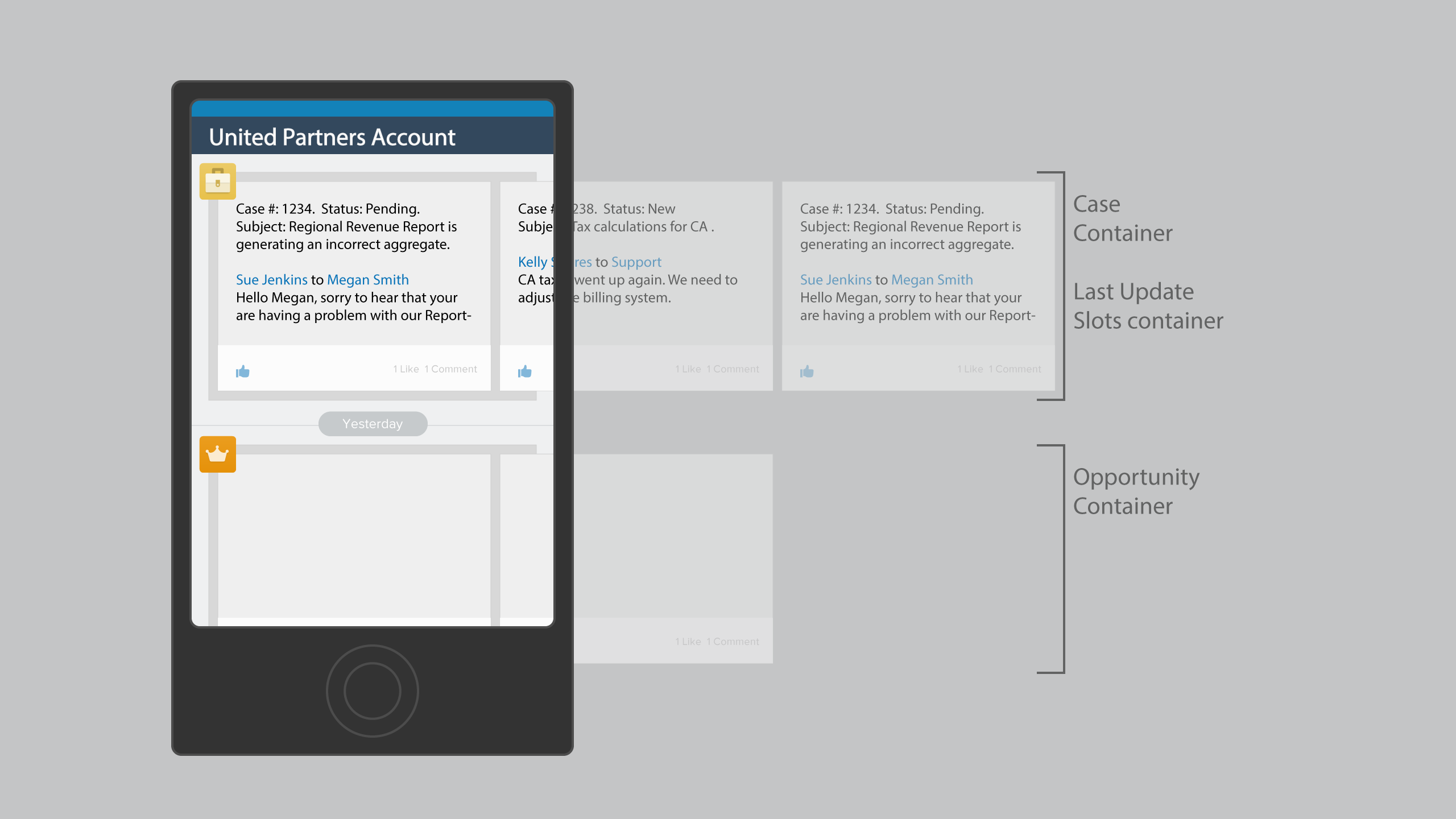
Solution 2. Contain Information
Creating a container for each type of transaction solves the noise issue. Users can slide into each container and dig into transactions if desired.
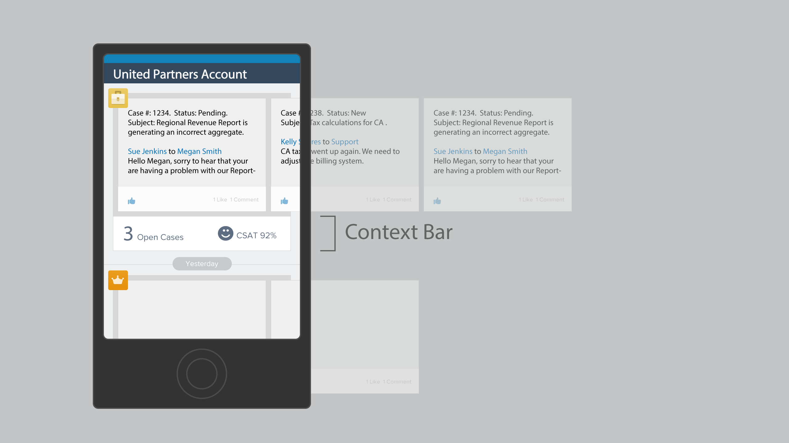
Solution 3. Add Context
We can move the needle even higher by providing context around each container. Now the user can glance the footer of the container and decide if they need to dig deeper. We have 3 open cases and customer is satisfied.